Controlling Captivate – Countdown Timer
January 24, 2014
Learning Solutions: Why We Love Design (And You Should Too!)
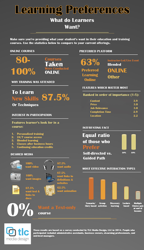
March 7, 2014We recently conducted a survey to determine what learners find beneficial in the courses they attend….the results are in and we’ve created the infographic below to share the results with you. These results can help you ensure the courses you’re creating are meeting the needs of your users.


3 Comments
Hi all,
The info graphic stats do not surprise me. Death by text is slow and horrible. Our online sessions use polling, chat, and whiteboards; not because it’s what learners want, but because it works. The interaction keeps the learners engaged and us on our toes. — Jim
Is your Content amount (3.9) correct in the Features Which Matter Most? If so, shouldn’t it be up at the top? If it isn’t, maybe it’s actually 2.9?
I’d also like to know what sample size was.
Thanks… nice infographic.
Good catch! We’ve updated the graphic. The sample was 100+.